26 April 2016

It's your final chance to nominate your local community space!


Have you nominated your local community space for my #25Project? If you haven’t heard about it, it’s my way of celebrating 25 years of Chalk Paint® and championing local communities. Anyone can enter, from anywhere in the world, but there are only 4 days left until the closing date! This project is so, so close to my heart and I cannot tell you how much pleasure it has given me, to see all the entries that have been pouring in.

It is tremendously exciting to think that 25 spaces - across the whole world (!!) - will be transformed by their communities, with the help of my expert stockists and, of course, buckets of my paint.

Once the deadline has passed, I will spend time in May going through each and every entry, reading the nominations and looking at all the pictures. I must admit, much as I’m looking forward to this, I know there are going to be some really tough choices to make – from those that I’ve peeked at already there’s a hugely diverse range of spaces to be transformed, and an equally varied range of locations! I’m so lucky to have truly expert stockists selling my paint the world over. Once I’ve chosen the winning entries it will be over to them to work with the community on these transformations.

All of my stockists are trained by me and fully understand how to use my paint. It will be they who take the lead on the actual make-overs. They’ll consult with the local community – including the winning nominator, of course – and come up with an inspirational design that will work in the space. My stockists will be there every step of the way, helping out the team of local volunteers to create something fabulous.

We launched the #25Project here in Oxford, where my shop proudly sits on the Cowley Road, and we kicked the whole thing off with the transformation of *my* local community space, The East Oxford Community Centre. The centre is used for a variety of activities such as yoga, toddler sessions, music groups and everything in between.

We (the team at HQ and I) spent a week with a whole host of regulars from the Centre, turning the much-loved space into something which really reflected how fantastic it really is. We got stuck in and had great fun working on all aspects of the job – from sewing curtains to some easy re-upholstering, not to mention a lot of painting! We had a blast. Everyone had a chance, not only to try out my paint for themselves, but also to share ideas and techniques – I think we all learnt something along the way.

So, if you haven’t got your entry in yet, what’s keeping you? Go to our dedicated site, and tell me all about your space and why it’s worthy of an Annie Sloan transformation. www.anniesloan.com/25project

21 April 2016

Nursery Style, Now!


Back in the late 1980s I wrote a book on Nursery Style with my friend Felicity Bryan, at the time I had three very different little boys (my sons Hugo, Henry and Felix) each wanting their own distinctive space in our family home. It was a joy to write, and between us we created some beautiful rooms that reflected all that was brilliant about the styles of that time.

Fast forward almost thirty years and I am absolutely smitten with being a grandmother – twice over, following the birth of the much-adored Rudy, a brother to Willow! Having young children in the family is magical, and it has made me think again about ‘Nursery style’. Proud daddy Felix (whom many of you will know from his work with me here at HQ and the co-author of my book, Room Recipes for Style and Colour) has been transforming Rudy's crib with Chalk Paint®. (Photograph coming soon!) The crib was a gorgeous gift from Elsa, my Stockist at Wood Picker in Athens - On her website she encourages us to consider that “with creativity and goodwill we can renew our home”. I love that, and it is so true of creating things for our next generation.

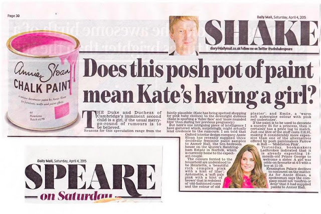
Nurseries take on a particular and a rather special importance, don’t they? They are a space created with so much love and so much expectation. Debates over the relative merits of pink or blue – or that old failsafe, yellow, rage on. You may have seen my paint in the news last year when it was rumoured that Kensington Palace had purchased three of the ‘pinkier’ colours from the Chalk Paint® palette (Henrietta, Antoinette and Emile) prior to the birth of Princess Charlotte, and that in itself was a pretty big clue as to the gender of the new addition to the Royal Family!


I posted on Facebook recently, looking for inspiration for my new grandson’s nursery; curious to see what others had created for their own children, grand-children, nieces, nephews… You know I adore seeing all your pictures, from entire rooms to single pieces. In my post I included pictures of the very funky travel-inspired nursery by Ashley Kaisk, which included a simple, classic chest of drawers in Duck Egg Blue and I simply couldn’t resist the sweet prettiness of baby Rosa’s cot (painted by Isabel in Scandinavian Pink).

I should probably reiterate here that both Chalk Paint® and my Waxes are completely Toy Safe and – importantly – won’t leave a lingering odour, which means you can use them freely to create wonderful, distinctive pieces to reflect all those wonderful, distinctive children in your life. As ever, please share your pictures with me – I’m still trying to decide on what I will create for Rudy!

Yours, Annie

15 April 2016

Fabulous Floors

Photo courtesy of Kate Dougherty Designs
Did you know that Chalk Paint® can transform old concrete and wooden floors, even if they’re varnished? Just like painting smaller (and bigger!) pieces of furniture and other pieces around your home, Chalk Paint® is just fabulous for painting floors.  The great thing is that you can create any number of looks and styles with this one pot of paint – add a little water to create a beautiful, soft wash of colour, or leave the lid off the tin for a few hours to create thick texture.

The clean appearance of simple white painted boards has long been a go-to look which works well with many different styles, but particularly with Coastal or Traditional Swedish. Swap Old White for Florence and you have instant Bohemian vibrancy; on old concrete floors try Graphite or Burgundy for that rougher Warehouse look, or contrast Provence with English Yellow for a graphic Modern Retro pattern (see my book Room Recipes for more explanation of these different themes).

When I know what look I want to achieve, I start by painting and lacquering a small test area, mainly because whilst you can use Chalk Paint® on any surface, I am always mindful that certain types of varnishes commonly used on flooring can sometimes be drawn through, and this can affect the finished colour (particularly with the lighter colours in the range). If a stain does come through on the area that I have tested I use my Lacquer to seal the whole floor. This will usually stop any bleed-through, and then I paint on top.  If all I’m after is a single colour, I usually do two or three coats in Chalk Paint®, before doing a single coat with my Lacquer last.  A little of this can go a long way and it dries with just a hint of sheen.  I really recommend you use it, especially for areas which will be walked over again and again.  I like to apply the paint with the larger of my brushes, but tend to use one of the rollers for the lacquer – this way it covers quickly and dries evenly.


A single colour is simple but effective. I have also experimented with a checkerboard design on my kitchen floor in the past. Here, I used a square sponge as a stencil, with Cream, Paris Grey and Old White. You can also be a little clever by creating a trompe l’ceil to mimic a different effect altogether.  My very clever stockists, La Restauroteca created the most wonderful illusion of a rug on the floor of their shop in Valencia.  This was actually painted directly onto a laminate floor, and then sealed with Lacquer.  They’ve used my Talullah stencil (a fabulous encaustic or even Moroccan tile effect) to make the pattern at the ‘centre’ of the rug and Valeska (a wonderfully versatile repeating pattern) to create a border.   Doesn’t it look great?  I particularly like their choice of colours, Old White and Burgundy lifted by Provence.


And, if you're feeling bold, take inspiration from my Stockists, Fig and Frolic, in Iowa, USA who  added colour to their living room with this fabulously vibrant floor.  Using bright colours from the Chalk Paint palette, they've randomly painted floor boards in clashing and complementary colours.

And take a lot at how Janice Issitt, one of my Painters in Residence, used Chalk Paint in Provence, Napoleonic Blue, Old White and Arles on the tiled floor of a bedroom to create a beautiful bright and bold, mediterranean look.


As always I love seeing your projects, make sure you tag me @anniesloanhome or use #anniesloan on Instagram, and share your projects with me on my Facebook page too. 


7 April 2016

Introducing my new Coloured Linens!


This is a very special week for me because I’m finally able to tell you all about my latest launch; a brand new collection of Coloured Linens, inspired by colours from the  Chalk Paint® range – how exciting!

This is a project which I’ve been working on for the past few months, and I hope you’ll be as thrilled with it as I am. I wanted to find a way to ‘mix’ colour from the Chalk Paint palette within the weft and warp of the fabric to create some new, exciting combinations which are quite unlike anything else I’ve seen. It’s what I love to do with my paint – mix it up and make something totally different. I’m delighted with the colours I’ve achieved here. Not only are they true matches to my paint palette, but the combinations I’ve chosen here cover all styles – from vibrant, bold and unexpected, to subtle, soft and neutral. They can either be the talking point of a room, or the quiet background to other pieces.

It’s taken some time, but I’m really, really happy with the finished fabrics, a linen/cotton mix, tumbled to make them super-soft, and strong enough for all types of upholstery as well as curtains, covers - even clothes!

The great thing about combining colours when creating fabric is that, not only can you create a unique single colour, but you can be clever and create a frayed edge ‘fringe’ by very carefully unravelling a little of the weft (which runs across the width), to reveal the warp colour (which runs across the length) underneath. Do play around with them, I’ve been experimenting, not only with fringes but also covering buttons (a look I really adore!) and adding piping to bring out either the complementary or, to be a bit more bold, the contrasting colours.


The combinations I’ve used are Aubusson and Provence, Louis Blue and Graphite, French Linen and Old White, Scandinavian Pink and Provence, Emperor’s Silk and Florence, Coco and Duck Egg Blue, English Yellow and Antibes Green, Napoleonic Blue and Barcelona Orange, Emile and Graphite and Old White and Violet. In some cases, they’ve complemented each other to create a new colour, in others they each remain true and contrast with each other in the finished fabric – it’s a fabulous effect, which I hope you’re going to love as much as I do. And, I’ve been really conscious all the way through the design process to create something that will work just as well in a Neoclassical look as it will in an industrial, Warehouse setting or Modern Retro, or Bohemian, or Traditional Swedish, Coastal…you get the idea!


I can’t wait to hear what you think of them and see how you use them in your own homes! Please, as ever, share your pictures on my Facebook, Pinterest and Twitter, and tag me on your Instagram.