Showing posts with label #Annie Sloan. Show all posts

15 March 2019

My lastest Painter in Residence, Girl in Blue Designs!

Charlie Anne Massey, better known as Girl in Blue Designs from Georgia, USA, has been on my radar for a few years now, and I’m delighted to cement the relationship by announcing her as my latest Painter in Residence!


No doubt you will have seen some of her pieces shared on my Instagram and Facebook – including once when she won one of my “Win-a-Tin” painting competitions. Charlie’s signature style is expressive, painterly and life-affirming; there’s an exciting, colourful wildness to her work which I find completely exhilarating. I’ve included some of her previous pieces below so that you can see for yourselves! I’ve also spoken to Charlie about her journey from Chalk Paint® novice to confident, capable, Chalk Paint® connoisseur!


“Since I could hold a pencil, I've always needed to create. For years that meant drawing, painting on canvas, and of course dabbling in various other mediums. Never once did it occur to me to try and make a living off of my art. I may have sold a drawing in a random social encounter here and there, but really it was always just something that I did for myself. Some people need to exercise the right side of their brains on a regular basis, and I'm one of those people. It wasn’t until I was 29 and very pregnant that I was introduced to Chalk Paint® by Annie Sloan. Once introduced, I just couldn't put that brush down. I painted small, easy to handle pieces that otherwise would end up in the dump. The amazing thing was, that they sold, and rather quickly! I was hooked! Once my daughter was born, I obviously had no time for the brush. Once she was 1-ish though, I began to find little pockets of time to work/play. It escalated from there…"


"…I can’t say that I was an immediate natural as far as painting furniture. Not by a long shot. I had a lot to learn, including the different styles of furniture, which styles of paint-work look good on said type of furniture etc. But when it clicked, it clicked. I started listening to what each piece had to say, noting which styles gained popularity with the few followers I had, and most importantly I learned to bend the rules and have fun…"


"…Within a couple of years, painting furniture with Chalk Paint® was no longer a hobby that provided me with a little supplemental income. It was my yoga, my passion, my art form, and my business! Once I figured out what I was good at and what my audience wanted to see from me, a hobby became the most stress relieving job I've ever had."

Keep your eyes on my Instagram, Facebook, Twitter and Inspiration Page to see all the pieces this Girl in Blue produces for her residency. I hope you are as excited as I am!

Yours,

Annie.

4 January 2017

Quick and Easy Step by Step with my Mini Project Pack!


This little side table is one of a pair that I'd recently acquired. Pieces like these are easy to come across and many people will already have something similar in their homes. They're often finished in that orangey pine that people have fallen out of love with which makes them the perfect candidate for a new year makeover using just a little of my paint, Chalk Paint!

And when I say a little paint, I really mean it -  it took just a couple of my small project pots to do the whole piece! If you were lucky enough to receive one of my Mini Project Packs over the holiday season and are looking for inspiration of how to use it, I hope this helps.

At this time of year, the colours that I start to use in my work are rich, earthy, warm and full of depth. They comfort me and give me that little injection of earthy nature that I so long for in the dark winter months. Which is why I've chosen to use Amsterdam Green and Aubusson Blue on this piece - two colours that work beautifully especially with the injection of Black Chalk Paint Wax which really brings out those deep jewel tones whilst highlighting the texture of the paintwork.

Or course you don't have to use these colours, and with my Mini Project Pack you choose the colours to suit your taste.


For this makeover you will need:
  • Small Project Pot in Amsterdam Green 
  • Small Project Pot in Aubusson Blue
  • Mini Clear Chalk Paint Wax 
  • Mini Black Chalk Paint Wax 
  • Pure Bristle Brushes
  • Wax Brushes
  • Lint Free Cloths 
1. Start by removing the drawers from the shell of the piece and paint the front of the drawers in Aubusson Blue using a Pure Bristle Brush. Apply the paint thickly, moving the brush in all different directions to create that gorgeous texture that my Coloured Waxes thrive on. 

2. Paint the shell of the piece in Amsterdam Green - again applying the paint thickly, moving the brush in all different directions.

3. Once the paint is completely dry apply Clear Chalk Paint Wax. Make sure you work the wax in to the surface and wipe away any excess with a lint free cloth. Using one of my Wax Brushes makes it really easy to get the wax in to all that gorgeous brushwork.

Annie Sloan Wax Brush
to
apply Clear Wax
to
the
painted surfaces. Wax Brushes aren
’
t included
in
the Mini Project Pack
but
are a brilliant
investment
and
make waxing so simple, b
ut
if
you
don
’
t have a Wax Brush a lint-free cloth
works well too. Work the Wax
in
to
the surface
and
wipe away
any
ex
cess.
Annie Sloan Wax Brush
to
apply Clear Wax
to
the
painted surfaces. Wax Brushes aren
’
t included
in
the Mini Project Pack
but
are a brilliant
investment
and
make waxing so simple, b
ut
if
you
don
’
t have a Wax Brush a lint-free cloth
works well too. Work the Wax
in
to
the surface
and
wipe away
any
ex
cess.
4. While the Clear Wax is still wet, begin to apply Black Chalk Paint Wax. Work the Black Wax in to the surface - pushing it in to the crevices in the paint and surface, and then, use Clear Wax to gently wipe away any excess of Black Wax. If you apply too much Black Wax, don't worry, the Clear Wax acts like an erase and can remove the Black Wax. 

And there you have it! I'd love to see how you've used your Mini Project Pack so please tag me on Facebook, Twitter and Instagram @anniesloanhome!

Yours, 

Annie 
  

15 November 2016

#25 Project Transformation 4: Sweden!


I’ve loved sharing with you the transformations of the #25Projects as they come in, and there are still plenty more to come, 21 in fact! This week the space I want to focus on is a little train station cafe in a place called Hindås, in rural Sweden.

When I picked this place as one of the spaces I was intrigued to see how the end result would look, and as the pictures were sent to me I was amazed at the incredible amount of heart and soul went in to the whole process. What truly stood out was how much of a sense of caring and community came through, and this was cemented by the wonderful description of the event sent to me by one of the volunteers, Märta Waldrop.

So lovely and moving was this letter sent to me that I think it best that you hear from the volunteers in their own words about the transformation of the space.

Take it away, Märta!

Before pictures of the space. 


"On the morning of Saturday the 21st of October, giggles could be heard from a corner of the train station located in the middle of the fairly modest Hindås community. They had been going since ten, waving brushes and rollers dripping with Chalk Paint® around in a room where nobody had paid any heed for many, many years. Until now.

The room, which for many years had been nothing but a humble goods reception, was now getting a facelift. For what purpose? To make it into what would be called ‘Hedda's Room’

Hedda Rasmussen Key, who has been almost as overlooked as the goods reception that was now getting some attention, was the sister of author and suffragette Ellen Key. She was also married to a man named Yngve Rasmussen, the architect that made Hindås Train Station into what it looks like today.

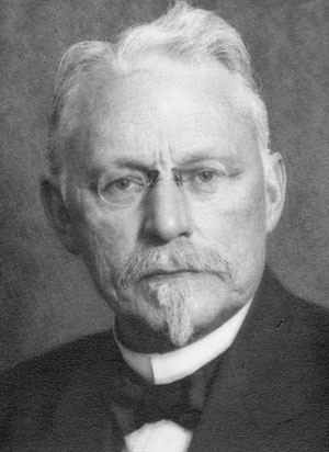
Hedda Rasmussen Key 
Yngve Rasmussen


When it was announced that Hindås Train Station had been picked as one of the 25 winners of the #25Project, the room that got picked to be repainted and, in a way, resurrected, was the goods reception. In the spirit of bringing back something that has been a bit pushed aside in the big scheme of things, it was decided to dedicate the room to Hedda, making sure that she had a space to be remembered as well.


A room for a woman who lived during a time when she had no say in the community, and died after suffrage for women had become legal. In the spirit of this, although quite an alien notion in our modern times, women played the biggest role in redecorating Hedda’s Room.


Everything was painted, with the walls painted in Duck Egg Blue Wall Paint. Walls, chairs, radiators, tiles, cabinets, even the refrigerator went from orange to a striped design inspired by the fabric from the Annie Sloan Fabric Collection. Music was playing, paint was splashing, coffee was drunk, and some participants also fell over at times! Volunteers from both the local community as well as from miles and miles away came to help create this new space, and this collaboration between different people, old and young, helped infuse the walls with a sense of belonging and inclusiveness for all who’ll enter in the future.


Freedom, acceptance, openness, courageousness, and kindness. That is what this room will hold. More and more people will bring their stories to this room, during concerts and theaters, as well as during the weekly language cafés. This is a room for all people, people such as Hedda.”

How utterly gorgeous is that description? I believe it truly matches with the photographs you can see here.

Let me know what you think of this and the other transformations I've shared so far by getting in touch on Facebook, Instagram and Twitter.

Yours,
Annie

25 August 2016

Announcing the #25Project Winners!


From the day I announced the #25Project I have been overwhelmed with the response from Stockists and customers from across the globe, and now the time has finally come for me to reveal the winning 25 community spaces, nominated by you! It was one of the most difficult tasks to whittle down over 300 deserving nominations to just 25, however I am thrilled with the final selection. Each one is completely diverse in its use and size, however the one thread they all have in common, from the kids creche in South Africa to the specialised dementia centre in The Netherlands, is that they are an absolutely vital part of their communities. I feel honoured to be able to assist them in their transformations over the next year, and I cannot wait to share with you all the stories and photos of each deserving and special space.

And without further ado, here are my final 25!


1. ’Jugend und Familiezentrum’ GERMANY

A volunteer run family centre that offers counselling services to families, young and old.

2. ’Remember Us’ IRELAND

A social group offering activities and support for people with special needs.

3. ’Centrum Voor Wonen En Zorg Heerma’ - THE NETHERLANDS

Specialised care and housing for dementia patients.

4. ’Studio Artes’ AUSTRALIA

A unique organisation that provides tailor-made creative activities and life skills for adults living with a wide range of disabilities.

5. ’Lawrence House Hinckley’ ENGLAND

Provides a safe and secure environment for homeless young people.


6. ’Tea Room Chateau Rocher-Portail’ FRANCE

A listed building that is turning into a public access museum and community space.

7. ’Muscatine Centre for Social Action’ USA

Providing emergency and temporary shelter, basic health care, educational and support services for those in need.

8. ‘Centre for Mestring’ DENMARK

‘Centre for Coping’ offers rehabilitation, education, activity and support for adults with mental health issues.

9. ‘East End Studio Gallery’ USA

Community based non profit organisation whose mission is to provide a platform for artistic expression in the community.

10. ‘Public Library of Sindos’ GREECE

A public library that was a former private school donated to the people of Sindos for public use.


11. ’Raglan Village Hall Association’ WALES

An association that works to improve availability, quality and use of community spaces in Raglan.

12. ‘Ottawa Community Housing’ CANADA

Providing housing and shelter to people with special needs across many communities in the city of Ottawa.

13. Methilhill Community Children’s Initiative’ SCOTLAND

Community group dedicated to providing local children with clubs, activities, nursery and education.

14. ‘CANSA Care Home’ SOUTH AFRICA

A home from home to cancer patients receiving treatment and care.

15. ’19 Carter Community Centre’ USA

This old church space has been lovingly turned into a dedicated community space for the local neighbourhood.


16. ‘Culture House of Nagymaros’ HUNGARY

An historical community centre in the city of Nagymaros used by locals for decades.

17. ‘School for the Deaf’ TURKEY

Providing education and support for the hard of hearing.

18. ‘Beachlands Community Centre’ NEW ZEALAND

A thriving community hub in a friendly and welcoming setting providing art and craft classes for all tastes and skill levels.

19. ‘Public Psychological and Pedagogical Advisory’ POLAND

A public space offering support and healthcare in the city of Katowice.

20. ‘Inthandokazi Creche’ SOUTH AFRICA
Dedicated educational space for young children to learn and play.


21. ‘Specialised Day Centre’ GREECE

A space for people dealing with psychological issues in the community.

22. ‘Hindas Station’ SWEDEN

Culture centre for public use, which holds various activities such as art classes and theatre groups for children.

23. ‘Kubono Kids Agri-Garden’ JAPAN

A specialised learning centre for children, specifically focused on educational gardening and horticulture .

24. ‘Village Hall in Swiatniki Gore’ POLAND

After being left to ruin, this community space will now become a place for children and adults.

25. ‘Centro De dia San Fracisco’ SPAIN

A vital and thriving community space in the heart of Spain.


I think you’ll agree that each space is very deserving of a transformation, and along with the help of their local Annie Sloan Stockist, volunteers and my paint and products, these community buildings will remain a vastly important part of their neighbourhood.

Check back in with me to see the transformations unfold, I cannot wait to get started with each one of the 25 spaces, so make sure to follow me on Facebook, Instagram and Twitter, using #25Project.


Yours, Annie

16 June 2016

East Oxford Community Centre Transformation #25Project


Over the past few weeks I've had the hard task of whittling down all of the nominations from across the globe for the #25Project! Going through each nomination (all 300+!) has been such an eye opener, there are so many deserving and incredible community spaces all across the world, so choosing just 25 was one of the hardest things I've had to do. From Scotland to Mongolia the scope of nominations blew me away, so I want to thank each and every one of you who entered your local space. I will be announcing the 25 spaces very soon, but I wanted to share with you how this all began and my local space that inspired it all.

The East Oxford Community Centre has been the beating heart of my neighbourhood for the past 40 years. My family, my incredible team here at Annie Sloan HQ and I have all used it's space in one way or another, from toddler sing alongs, volunteering at the drop in kitchen for refugees, to the famous open mic night. I have always loved the building but knew it needed a little help here and there, so my team and I got stuck in giving the front room a transformation! I knew that I not only wanted to get the community involved but also run workshops too, as I wanted to make sure that the community had the biggest hand in helping transform their space. We ran workshops in upholstering, curtain and cushion making, painting, printing, stencilling and dyeing, and then we had two long days of painting everything and anything! I think the photos below show just how much hard work and fun everyone had along the way!

Volunteers and the local community all chipping in, painting and creating!

I chose cool colours for the walls, such as Aubusson and Versailles, and warmer colours like Barcelona Orange and Primer Red on smaller pieces like the piano and cushions. 
We painted the piano, that was kindly donated by a local church, Barcelona Orange and Duck Egg Blue, and teamed it with a stool painted Provence. 

I loved the beautiful patina of the exposed brickwork, so we chose a soft tone to make the brickwork the star! 

Pillows and cushions dyed stencilled and stamped in my colours 

The chairs were all painted and upholstered by the local community, stacked up and ready to go! 

A shot of the final transformation, with new curtains and cushions, pianos and tables all in place!  

If you want to have a look at how it all came about, watch this little video all about the transformation!


I had so much fun transforming this space, I cannot wait to start transforming the 25 spaces across the world, with the help of my wonderful Stockists over the next year! Keep a look out on my Facebook and Instagram for the chosen 25, coming very, very soon! 

Yours, Annie


7 June 2016

'A Man' by Hanayuishi Takaya, my new Painter in Residence!


Today I have the pleasure in sharing the first Painters in Residence project from Hanayuishi Takaya. Mr Takaya makes bespoke headdresses that are true works of art, made on the spot with what he has to hand and mainly using natural materials such as flowers and foliage.

As soon as I saw this set of images I was completely blown away. They are so powerful and so visually striking, they immediately evoked memories that I have from my visit to Japan. 

I was lucky enough to have visited Japan in the spring of last year. Japanese art and culture has always fascinated me ever since I was at art school. I especially love the works of Utagawa Hiroshima and Kitagawa Utamaro, their beautiful muted colour palettes offered me so much inspiration in my own work, from school right up to the furniture I paint now.

There are over 60 stockists of my paint and products in Japan and the work that they create is always elegant and interesting. Unsuprisingly there seems to be a penchant for more craft based work, with origami being featured quite frequently. Whilst I was there I was very inspired by the complete bond that the Japanese have with the nature that surrounds them; it inspires their creative work and there is a great deal of respect and care taken into preserving and upholding traditional practices.

From the iconic cherry blossoms right through to flower arranging and tea ceremonies, their love of Japanese nature is intrinsically linked to Japanese art, and yet, as times change there is a shift into using these traditional ideas, and love of detail, into a more modern aesthetic and practise.

So this Koi head dress by Mr. Takaya is a beautiful example of that link and movement, with Koi being one of Japan’s most famous creatures, a true symbol of their national identity. I adore that the model used here is a Japanese man, there is such a fantastic contrast between the femininity of the florals used and this mans strength and steely reserve. 


Shiro, the husband of our distributor Kimie in Japan, is actually a world renowned expert in Koi Carp, and even goes to California to judge Koi competitions. He showed me some large tanks that housed prize winning Koi whilst I was there and I was taken aback by the variety, black, white, yellow, orange in all shapes and sizes! They are extraordinary creatures, their colours are incredible and I love the way they glisten and shine as they glide through the water. There is a such a beauty in the variety of patterns too, I felt very inspired and privileged to see these magnificent fish in one of their native lands. 

Mr Takaya is hugely influenced by colours, this stems from his childhood as he grew roses just to see the variety of colours. I adore the fact that he is very sensitive to colours in his work and is almost dictated by the changing of the seasons in Japan. 

To create this Koi sculpture, Mr. Takaya first created the Koi using papier mache and then painted its distinctive pattern using Chalk Paint in Original, Emperor’s Silk and Graphite. To add a more realistic finish, he ingeniously used my Craqueler and Dark Wax, evoking the scales of the fish. The flowers he used include different varieties of chrysanthemums, which are typical Japanese flowers. The way he has placed the fish on to the headdresses looks so much like it is swimming through the flowers, just like it would swim through the seaweed.

I have completely fallen in love with this work, it is unlike anything I have ever seen created with paint and products, it feels fresh and new.

This, to me, is a true representation of Japan. Strong, bold, proud, a little unusual but always, always beautiful.

Yours, Annie

27 May 2016

Introducing the Annie Sloan MixMat™


Even though my schedule is hectic - I am lucky enough to be flying from one place to the next, visiting stockists, media and customers - I always try and paint everyday. Sometimes it’s just a quick sketch in my notebook, other times I can spend the day transforming whole sets for videos and photoshoots. Once I have an idea or style in my head, I work quickly, and use whatever I can get my hands on when working. I love mixing my colours to create hundreds of new shades, and for years and years I have been testing my colour mixes out on the closest surface to hand - my trusty studio table!


As you can imagine, after years of use, layers and layers of paint have built up on the table surface. They are uneven, cruddy and even though I think they look incredible, they haven't left me with the best, flat, even surface to work on! My son Felix, who some of you may know works with me here at HQ, was getting rather annoyed with my constant tabletop colour mixing!

To combat this the team and Felix came up with my new MixMat™! I’ve never seen a product like this before, its a complete one off, and now I can’t do any work without it.

The MixMat™ has been created to work on a flat surface, so it can be placed down on a tabletop or surface easily. It is made of a silicone-like material which both makes sure that paint doesn’t just glide off and also -rather cleverly - encourages paint to be taken up onto a roller or brush. I wanted something that I could use again and again without any leftover colour being absorbed in to the colours that I choose. A quick wash in warm soapy water is all they should need and I just use a wet sponge to get rid of any lingering pigment. Their handy shape and size means that, once you've finished using it, they can be rolled up and stowed away until the next time you paint!


It's perfect for mixing colours, for stencilling and stamping and for inspiration too! I wanted the design of the MixMat™ to be filled with tips, tricks and ideas, so on one side I have a whole host of of my own doodles and drawings to inspire your own free hand sketching. On the other side I have added a handy colour mixing guide. I talk about complementary colours, how to darken shades, clashing colours, how to create complex greys. My colours are meant to be mixed together, they have very little black in them so you'll never end up with a muddy colour when you blend them together.

I’ve fallen in love with the MixMat™, it has become an essential part of my painting toolkit, and I hope it will be part of yours too.

Yours, Annie

20 May 2016

Annie Sloan and Friends at ArtsWeek!


Here in Oxford, during the month of May, a festival celebrating all things art takes place: Oxfordshire ArtWeeks. Local artists display their work all over the county in open studios and spaces, and often in their own homes. It is one of my very favourite times of the year, and I love spending an afternoon on the ‘trail’ visiting different people and seeing creativity in all its forms. It’s so well organised and just a lovely, affirming thing. I think it’s an idea that has been taken up by other places, but the Oxford ArtWeeks is special to me. Not least because my friend, radio-presenter Bill Heine, was one of its founders. His own experiment with art has become one of Oxford’s most famous landmarks – The Shark House in Headington. People come from far and wide to see this wacky sculpture, I love it! Oxford has been home to me since 1983, so I have seen this festival grow and grow with each passing year.

This year I really wanted to support ArtWeeks in my shop on the Cowley Road, and so we have had a mini-exhibition of all of the work created here, by me and the team at HQ. There was a huge amount to display as I am lucky enough to be working with some very brilliant and creative people. I want to support any and all creativity and encourage my team to develop their own skills, be it screen printing, painting, jewellery making or textiles! Some people have created work all their lives and I loved showcasing their pieces. Holly who works in my studio with me creates fabulous screen prints, using imagery from endangered species native to the UK, including lots of birds and bees. Rudi in our Fabric Team is a very talented jewellery designer, using found objects that she forages for around Oxford and creates bespoke pieces, inspired by nature. Joanna, who works in Design, kindly showed her gorgeous green painting, I love that even though she is creative at work, she still loves painting as a relaxing pastime. Ann, one of my creative assistants, hand crafts these gorgeous pyjama sets for little ones out of vintage bed linen, just look at those candy stripes!


Each Tuesday we have a life-drawing class in my studio at HQ, everyone is welcome, regardless of ability or skill. What I love about our life drawing class is that you have people who haven't drawn since high school, people who draw regularly right down to some who have never drawn before! I love the variety and I think you will agree there is some serious talent on display.


The great thing about Art Weeks is it is really inclusive, so it’s not simply drawing and painting but a celebration of all creative activity - photography, textiles, sculpture, glass, jewellery, digital art and much more. Such a brilliant idea! A lot of my team create their pieces outside work so it was just fabulous to be able to put it all together in one place along with some of my own pieces from over the years, from painted pieces to sgraffito work and even a study of cows which somehow I’ve kept for all this time! If you are in the area please do pop down and see the work, if you are further afield as always, follow me on Facebook and Instagram as I share more from ArtsWeek.

Yours, Annie

13 May 2016

Celebrating the past in the USA!


Last week I was back in the States to attend Iowa’s annual Junk Jubilee in the city of Des Moines. There’s quite a buzz around Des Moines, and I really didn’t know what to expect when I arrived. It was my first time in the Mid-West, so I was excited to visit a different America than what I was used to. It was so cool – lovely people and a great emerging arts scene. I’ve heard people say the vibe in Des Moines is similar to Brooklyn, New York, and I really saw what they meant. There are great cafes, an amazing sculpture park and I owe a big thank you to the lovely John Whaley from Junk Jubilee who squired us around, making sure we got to all the cool places – he even gave us tickets to see Graham Nash at a beautiful old theatre  – what a bonus!

I got to the city a couple of days before Junk Jubilee so that I could do some promotion and actually held a version of my Stockist workshops for a group of around 25 journalists – Meredith Corporation who publish some of America’s most popular magazines is based in the city - and I also did some television and radio appearances.  


Junk Jubilee itself was fabulous! It was Americana to the extreme. It’s interesting, in the UK these sorts of events are often a mixed bag – a little Victoriana, perhaps a stall with nothing but glassware, some mid-century modern pieces, and in France I’ve been to many vide greniers which literally translates as empty attic! Junk Jubilee was much more curated, with lots of really cool agricultural artefacts, which I suppose speaks of Iowa as a farming state: flags, plates, and metalware – chippy paintwork and sumptuous patina! There was a real sense of nostalgia but in many cases it wasn’t so much that the pieces were terribly old, but they were certainly treasured. Many things had been cleverly repurposed. In fact, I met this really sweet young man, called Zane Hehnke, who had a great stall selling repurposed pieces – he’d been doing this since he was 13 (and is only 17 now!). Very creative. I also loved, loved, loved the many cool examples of packaging and typography.


I stayed on an extra day after Junk Jubilee to run a stockists workshop at the very hip Des Moines Social Club. I think you know by now how much I adore seeing my stockists, and we had around 40 from all over the States. Don Short who runs the inspirational West End Salvage – four stories of architectural salvage in an incredible old warehouse– treated us all to lunch, so I also owe him a huge and heartfelt thank you!

From Des Moines I travelled on to New York to meet our new PR team and do more magazine interviews, including some one-on-one workshops with various editors. Whilst I was there, Country Living asked me to do a Q&A on Facebook at my stockist in the East Village, Verdigreen, run by the amazingly named Azie Shelhorse! I thought it would be a great time to demonstrate my new Black and White Chalk Paint Waxes and was thrilled to see the views whizzing up past 80,000 in the half hour that we were live. Just amazing.


To cap it off, that evening I went with my friend Mary Anne to an event at New York University. Mary Anne was in a band with me called The Moodies, back in the ‘70s and had made friends with a young man called Andrew Carpetta who is writing a PhD on the connections between the music scene and art schools in the 70s and 80s which I wrote about last time I visited New York. I mentioned then how much I wanted to see a film featuring The Moodies which Andrew had unearthed and my wish came true! The screening was part of a series called The Colloquium of Unpopular Culture (I love it!) and I hadn’t seen this film for 20 years. Afterwards he’d organised a Q&A afterwards – there were three of us from the band, me, Mary Anne and also Rod Melvin, joining Andrew on stage. Somehow the idea of the past being celebrated in a whole new way sums up the whole trip!