Showing posts with label colourist. Show all posts

20 September 2019

The Colourist Issue 3: Fill your life with fabulous colour

Welcome, to the launch of The Colourist Vol. III! Fill your life with fabulous colour, starting here. This time, I've focussed on blues and greens.

How time flies. It feels like only yesterday that I was announcing the launch of Issue 2, and barely any longer than that when I was introducing you all to the very first edition. But here we are, and what difference a day (year) makes! We've listened, re-calibrated and rejuvenated The Colourist yet again, taking our best bits and building on them. Get set for a Bookazine like no other.


Packed to the gunnels, my third bookazine is based around the colour blue and, in particular, my divine new Chalk Paint® colour, Oxford Navy! That’s the hero of this issue, with sterling support from sidekicks Provence and Florence.
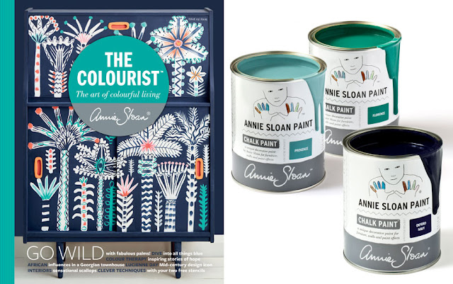

We’ve gathered together diverse pieces from all over, such as the vibrant Truck Art of Pakistan, fabrics from the legend that is Lucienne Day, idiosyncratic Indian glass paintings, Adam Calkin’s fantastical painted house, a piece on the healing power of painting, all that’s magical about Brooklyn, New York, two brand new Chalk Paint® colours never before announced, as well as furniture painters from all over the world. Just one thing unites them… colour. Colour in all its combination from lively and bold, to quiet and gentle.


As well as this and more, we've supplied six more step-by-steps for amazing projects you can recreate at home; from using your two free stencils (!!) to create your own Art Deco looks, to the secrets of frottage and distressing, via fantastical tassel creations and gemstone imitation – all of which can be done using furniture and Chalk Paint® you already have! I have always been especially thrilled by how well the How-Tos at the end of The Colourist have done. I get a real kick from seeing how you take my Inspiration and incorporate it into your own homes, with your own twists and tricks. I can only urge you all to give this issues a try!


You may already know that I’m a bit of a culture vulture. I love looking at pictures and patterns wherever I go, but art galleries and museums are always a brilliant place to start. I’m very lucky to have the wonderful Ashmolean Museum right on my doorstep in Oxford. Established over 300 years ago, its collection was described as a ‘cabinet of curiosities’ at the time, which is a delightful phrase that describes an enclitic collection of rare and interesting finds. I think I also subscribe to this type of collecting – I’m always in the lookout for amusing, thought-provoking pieces for my own home!

It could be said The Colourist is a kind of a modern-day ‘cabinet of curiosities’ in magazine form: you’ll find things to amaze, inspire fascinate, surprise – and maybe even make you want to cry a little – in this issue! And if that hasn't convinced you to pick up a copy, you can see a sneak peek inside here.

Thanks for reading, staying in touch and supporting me through my ventures. I hope to do the same for you. Tag me @AnnieSloanHome on social media with the hashtag #ColouristMag so I can see what you get up to.

Yours,


Annie.

19 January 2014

The eye-catchy colours of Paul Klee (1)


What can I say about avant garde artist Paul Klee except he really knocks my socks off! I’d forgotten how much he has influenced me until a recent visit to the Making Visible Exhibition at Tate Modern (on London’s South Bank).


Katie Harrison (‘honorary daughter’) made me go with her boyfriend Hugo Manual (my youngest son aka Chad Valley) because as a creative herself she’s very keen on the idea that you need to ‘feed yourself’ as an artist; and she’s absolutely right!  But I need to be told this as otherwise I just keep my head down and work. So seeing the Klee show spurred to me to produce new pieces AND to think about the nature of colour.

What’s the key to Klee?
To my mind Klee (1879-1940) was a great colourist and colour has always made a huge impact on me. 


He was a very measured artist, very very thorough – though when you first see his work you think he is (oddly) lyrical and light, and quite slight. In fact when he gets into something he’ll do it again and again and again really understanding it.  He’s actually quite a mathematical artist, which I really appreciate as I love the mix of art and science. Klee was exploring a whole system: take a look below at Fish Magic (1925, 77 x 98.3 cm oil and watercolour on canvas).


It’s his exploration of colour using squares and rectangles on other background colours that knocks me out as below with Lowlands (1932, 30 x 48 cm, watercolour on paper) ...

Learning from a master of colour
The watercolour that impacted the most for me was Polyphony (1932, 66.5 x 106 cm) and on seeing it I knew I had to get home and work something up from this. In this work, he creates layers and layers of colour using a pattern of squares overlaid with different coloured dots.
It’s all about how colours are affected by the colours underneath them… how colour works and I’m tremendously interested in that. This piece made me think I want to do something like that, so I went to work when I got back to the studio.

Klee-coloured chest of drawers
The first thing I did was find a fairly modern chest of drawers that I could work with.
1. I painted the whole thing using Chalk Paint® in Paris Grey first for a good neutral background. 
2. I then ripped off various flaps from cardboard boxes and painted onto them. I used a limited number of colours from the Chalk Paint® range to keep the effect similar in tone (but not so similar that you couldn’t differentiate i.e. nothing very contrasty).
3. Next I printed (i.e. pressed) the cardboard squares onto the cabinet which gave a slightly uneven effect. The flaps of the cardboard boxes were a good size to cover fairly large areas (if the cardboard bits are too small it gets boring trying to cover a large area – so be bold use big!). 
4. Then when that was all printed (and using the same colours) I roughly applied paint onto some bubble wrap. 
5. Finally I pressed the ‘tips’ of the bubble wrap onto the surface of the chest of drawers to create the dot effects.

Be bold, be experimental
So basically you have two layers and yes it’s very messy, your hands are covered with paint and there are bits of used-up plastic and cardboards all over. 


I want to do more because now I’ve finished it I realise it was like a rough first draft and that’s fine because it’s interesting and unique and I am very pleased with it. But having done one experiment I can see other ways of doing it – just as Klee would have seen it – you don’t have to be perfect and precise and that’s what makes it so beautiful. So I’m going to try another one, perhaps this time with a more neutral finish all in greys, beiges and white. Watch out for more Paul Klee-inspired pieces!

Yours, Annie