Showing posts with label English Yellow. Show all posts
13 March 2020
International Women's Day 2020: interview with Sophie Robinson
Question 1)
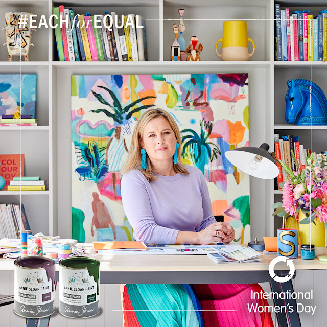
I’m Sophie Robinson and I’m an interior designer and broadcaster. I left university in the late 1990’s and got my first job on an interiors magazine in 2000. I went freelance in 2005 and have since worked as a stylist across all the top interiors magazines. I was Head Judge on BBC Two’s The Great Interior Design Challenge from 2014-2017 and regularly help the DIYSOS team with interior design for the Bafta award winning TV show on BBC ONE. I now host a podcast The Great Indoors (Annie appeared on Episode 1 of the current series!) and run my popular blog and Instagram account @sophierobinsoninteriors. I publish online courses and host workshops to help people understand how to decorate their homes with lashings of colour!Question 2)
My career has been very organic and going freelance in 2005 was the best decision. It’s allowed me to grab opportunities and grow my business in a way that suits me and now suits my life as a working mother. My son was born in 2011 and I stepped back from my career for a couple of years while he was very small. Filming TV was a strain as it meant being away from home through the summer, so I’m glad it was for just three years. I now work from home and manage my business around the school day. I use social media now to share my love of design and market my courses and workshops, as well as work with brands spreading my love of colour and interior design. No two days are ever the same!Question 3)
My industry is wildly supportive and I’ve found everyone to be hugely helpful on my way to success - especially the community on social media. My fellow colleagues inspire me in business, holding positions of influence and change in this ever-changing digital media. Kate Watson-Smyth, my podcast co-host is an exceptional interiors author, having just published her third book in as many years. I get such a buzz working with her. I admire all the female magazine editors who I have worked for over my career who have created great content for their readers and now I find myself admiring women like Zoe Ball and Claudia Winkleman, who are showing us that women over 45 can still have a dazzling career in the media spotlight!Question 4)
I was completely blown away to be invited to be the judge on The Great Interior Design Challenge. It felt such a huge privilege to pass judgement on the contestants’ talent and hard work. I’m thrilled to be part of BBC Two’s new follow-on show Interior Design Masters, which continues the great work of bringing interior design to the masses and showing people that (almost) anyone can do it!Question 5)
You’ve got to love it! If you can discover your passion in life and run with it then you’ll have a better chance of enjoying every day. We spend most of our life at work so better make it fun and if you are pursuing something you care about you are more likely to succeed as you’ll put the energy required into it. And don’t be afraid to quit if it’s not working out and take chances too!Question 6)
English Yellow because I’m eternally smiling and optimistic!2 December 2015
Jelena Pticek's English Yellow Sideboard

Jelena chose to work with a simple technique and one main colour – English Yellow – to really emphasise the transformation that can be made from painting an old, pre-loved piece. English Yellow is a brilliant bright yellow from the Chalk Paint™ palette and is a great fifties, vintage colour. As well as brightening the piece up, Jelena wanted to emphasise the wonderful ornate detailing which was previously almost unnoticeable. To do this, she lightly rubbed sandpaper over the details to reveal areas of the original wood.
Inside the cupboard, Jelena used Scandinavian Pink, a colour that works beautifully for the interior of cupboards and drawers, and created a gorgeous contrast. Jelena then finished the piece with my Clear Soft Wax.
How have you used the wonderfully colourful English Yellow on your projects?
And remember to follow #PaintersInResidence on Instagram and Facebook, as well as my Painters in Residence board on Pinterest.
How have you used the wonderfully colourful English Yellow on your projects?
Yours, Annie
And remember to follow #PaintersInResidence on Instagram and Facebook, as well as my Painters in Residence board on Pinterest.
14 April 2015
Abigail & Ryan Bell's Floral Coral Chest of Drawers
For their second project as Painters in Residence, Abigail and Ryan Bell (of Abigail*Ryan) experimented with mixing my colours to create this bright – almost neon – coral pink.
Abigail and Ryan had a very specific colour in mind for this little chest of drawers – something retro and vibrant to match the clean lines of the piece. To find the colour that sang for them, they began mixing colours from the Chalk Paint® palette; Scandinavian Pink, Emperor's Silk, Barcelona Orange, a little English Yellow and Pure... and voilà! (Mixing colour with Pure as opposed to Old White will create a very clean, bright colour. Mixing colour with Old White creates a softer hue.)
As Abigail and Ryan were looking for a smooth, modern finish, they used my Flat Brush to apply the paint. The pair applied my Soft Clear Wax to protect and finish the piece, and then styled it with a vibrant floral arrangement bursting from the drawers. The perfect stand-out Spring piece.
Have you ever used Chalk Paint® to create a decorative display for your home or garden?
Yours, Annie
Follow this blog for exclusive pictures from Abigail and Ryan's residency and follow them on Instagram, Facebook, and her website: www.abigailryan.com
And remember to follow #PaintersInResidence on Instagram and Facebook, as well as my Painters in Residence board on Pinterest.
18 February 2015
Beau Ford's Striped Side Cupboard
This gorgeous sideboard is the last project from Beau Ford's three months as a Painter in Residence. Beau's neighbour in rural Australia inherited the cupboard from her Grandfather and had been storing it in her shearing shed. Beau cleaned off the cupboard and used my paint, Chalk Paint®, to create a refreshed modern piece – a lot more fitting for the hip, growing family farmhouse that it was returning to.
Beau used a palette of Antibes Green, Duck Egg Blue and Coco to create the base block colours. The mustard yellow is a mix of English Yellow, with a spot of Emperor's Silk and Coco. Beau told me she seems to go the long-way round to find her perfect mixes – but I love her playful experimentation with mixing colours. It's something I always encourage!
The triangle pattern that runs vertically down the front of the cupboard has been hand-painted in Greek Blue using a very small artist's brush. The whole piece has been finished using my Clear Wax to protect the surface and make it wipeable.
I hope you've enjoyed following Beau's residency and feel inspired by her playful and bright projects. Later this week, I will be introducing you to my next set of three Painters in Residence, so keep your eyes peeled!
Follow Beau on Instagram, Facebook, and her blog: http://drip-designsfurniture.blogspot.com.au
And remember to follow #PaintersInResidence on Instagram and Facebook, as well as my Painters in Residence board on Pinterest.
I hope you've enjoyed following Beau's residency and feel inspired by her playful and bright projects. Later this week, I will be introducing you to my next set of three Painters in Residence, so keep your eyes peeled!
Yours, Annie
Follow Beau on Instagram, Facebook, and her blog: http://drip-designsfurniture.blogspot.com.au
And remember to follow #PaintersInResidence on Instagram and Facebook, as well as my Painters in Residence board on Pinterest.
9 February 2015
Janice Issitt's Moroccan-inspired bedroom

Today, I am sharing the last project from Janice Issitt's three months as one of my Painters in Residence. Her Moroccan-inspired, bohemian bedroom sings with colour – and has all been achieved with my Chalk Paint® palette.
The way Janice works reminds me of the way the Bloomsbury set painted Charleston Farmhouse – no surface is left unpainted. Walls, floors, furniture and ornaments are all constantly being painted, re-painted, re-worked and re-imagined. Janice works from her home – the various rooms in her house are her work studios and are therefore in a constant state of flux, much like my own!
Here, Janice has used Provence as a backdrop, and has stencilled a mandala shape onto the wall using Napoleonic Blue. She painted the bed in Barcelona Orange with a feather design in Florence. On the tiles on the floor, she used Provence, Napoleonic Blue, Old White and Arles. The Moroccan-style side table features Henrietta, Provence, Napoleonic Blue and English Yellow, and the screen is Old Violet, Barcelona Orange, Emperor's Silk and English Yellow. The furniture has been finished in my Soft Clear Wax, and the floor has been sealed using my matt Lacquer.
Next week, I will share the last project from Beau Ford residency, and following this I will be announcing my next set of fabulous Painters in Residence. I can't wait!
Yours, Annie
Follow Janice's on Instagram, Facebook, and her blog: janiceissittlifestyle.blogspot.com
And remember to follow #PaintersInResidence on Instagram and Facebook, as well as my Painters in Residence board on Pinterest.
19 November 2014
Beau Ford's Work Hard, Be Kind Desk
For her third Painters in Residence project, Beau Ford gave this sad and forgotten school desk a complete make-over using my paint, Chalk Paint®.
After replacing the top and giving the whole desk a quick clean, Beau set to work on the paintwork. First, she painted the base of the desk in English Yellow, then applying Paris Grey as an accent on the feet.
She painted the top of the table in a chevron pattern, using a ruler as a rough guide. She worked with a range of colours to make a bright statement: Barcelona Orange, Scandinavian Pink, English Yellow, Provence, Greek Blue and Napoleonic Blue.
When you lift the lid of the desk you find a charming surprise – the words "Work Hard, Be Kind written in lovely, freehand type.
Beau used Clear Wax and Dark Wax to finish the piece and give the overall piece an aged look.
What do you think? Have you used Chalk Paint® to create a bright and bold pattern on your furniture?
Yours, Annie
Follow this blog for exclusive pics from Beau's residency and follow her on Instagram, Facebook, and her blog: http://drip-designsfurniture.blogspot.com.au
And remember to follow #PaintersInResidence on Instagram and Facebook, as well as my Painters in Residence board on Pinterest.
13 November 2014
Janice Issitt's Boho Door
Janice found this dark wooden, carved, Victorian door in a charity shop and had to have it! She has taken the door and repurposed it using lots of bright colours from the Chalk Paint® palette to make a bold Bohemian statement.

Janice told me that "a lot of things went in to the alchemy" when it came to mixing the colours for this piece. She loves to experiment with colour mixing and stores any left-over mixes in pots, and will revisit these when beginning a project – adding other colours in to them to make the right tone for the next project.
For this piece Florence and Antibes have been mixed in different amounts to create different tones of green. Old White has been added to some parts and English Yellow to others. Napoleonic Blue and Emperor's Silk were mixed to make the deep purple panels, and a touch of Emperor's Silk has been added to Barcelona Orange to deepen it.
The panelled wall surrounding the door has been painted in Napoleonic Blue and stencils have been added in its complimentary colour, Barcelona Orange!
What do you think? Have you ever used Chalk Paint® to create a Bohemian look?
Yours, Annie
Follow this blog for exclusive pics from Janice's residency and follow her on Instagram, Facebook, and her blog: janiceissittlifestyle.blogspot.com
And remember to follow #PaintersInResidence on Instagram and Facebook, as well as my Painters in Residence board on Pinterest.
27 January 2013
Cuba Colour
+
Provence + Greek Blue + Old White
![]() |
Barcelona Orange |
![]() |
Scandinavian Pink with some Emperors Silk |
![]() |
French Linen |
![]() |
Graphite |
![]() |
The colour of the car with the yellow and deep red in the background |
![]() |
Primer Red |
![]() |
English Yellow |
![]() |
The car has a top of Aubusson Blue |
![]() |
For the main part with the car I'd make a greenish grey with Paris Grey mix with some Chateau Grey. The chrome lines are terrific too - maybe with some aluminium leaf. |

![]() |
Cream |
![]() |
Old Violet |
+
![]() |
Greek Blue with Old White |
Subscribe to:
Posts (Atom)